CSS3使用过度动画和缓动效果案例讲解
浏览:9日期:2023-03-15 17:04:47
transition过渡:
四个小属性
- transition过度属性是CSS3浓墨重彩的特性,过度可以为一个元素在不同样式之间变化自动添加“补间动画”

- 兼容性IE10开始兼容,移动端兼容良好
- 曾几何时,网页上的动画特效基本都是由JavaScript定时器实现的,现在逐步改为使用CSS3过度
- 优点:动画更细腻,内存开销小
- transition属性有4个要素:
transition:width 1s linear 0s;(什么属性要过度、动画时长、变化速度曲线、延迟时间)
<!DOCTYPE html>
<html lang="en">
<head>
    <meta charset="UTF-8">
    <meta http-equiv="X-UA-Compatible" content="IE=edge">
    <meta name="viewport" content="width=device-width, initial-scale=1.0">
    <title>动画过渡</title>
    <style>
        .box {
            width: 200px;
            height: 200px;
            background-color: black;
            transition: width 5s linear 0s;
        }
        .box:hover {
            width: 500px;
        }
    </style>
</head>
<body>
    <div>

    </div>
</body>
</html>
就是需要过渡的的加属性值transition,第一个值为变化的属性
哪些属性可以参与过渡
- 所有数值类型的属性,都可以参与过渡,比如width、height、left、top、border-radius
- 背景颜色和文字颜色都可以被过渡
- 所有变形(包括2D和3D)都可以被过渡
all:
- 所有的属性都要参与过渡,可以写all
transition:all 5s linear 0s;
<!DOCTYPE html>
<html lang="en">
<head>
    <meta charset="UTF-8">
    <meta http-equiv="X-UA-Compatible" content="IE=edge">
    <meta name="viewport" content="width=device-width, initial-scale=1.0">
    <title>动画过渡</title>
    <style>
        .box {
            width: 200px;
            height: 200px;
            background-color: black;
            transition: width 5s linear 0s;
        }
        .box:hover {
            width: 500px;
        }

        .box1{
            width: 200px;
            height: 200px;
            background-color: blue;
            transition: all 5s linear 0s;
        }
        .box1:hover {
            width: 400px;
            height: 200px;
            background-color: greenyellow;
            border-radius: 50%;
        }
    </style>
</head>
<body>
    <div></div>
    <div></div>
</body>
</html>
过渡的缓动效果:
缓动参数
- transition的第三个参数就是缓动参数,也就是变化速度曲线
transition:width 1s linear 0s;
常用的缓动参数
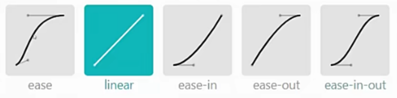
子属性
transition-timing-function:ease;
<!DOCTYPE html>
<html lang="en">
<head>
    <meta charset="UTF-8">
    <meta http-equiv="X-UA-Compatible" content="IE=edge">
    <meta name="viewport" content="width=device-width, initial-scale=1.0">
    <title>动画过渡</title>
    <style>
        * {
            margin: 0;
            padding: 0;
        }
        .box1 {
            border:1px solid black;
        }
        .box1 p{
            width: 50px;
            height: 50px;
            background-color: blue;
            position: relative;
            left: 0;
            margin-bottom: 10px;
            transition: left 5s linear 0s;
        }
        .box1 p:nth-child(2) {
            transition-timing-function: ease;
        }
        .box1 p:nth-child(3) {
            transition-timing-function: ease-in;
        }
        .box1 p:nth-child(4) {
            transition-timing-function: ease-out;
        }
        .box1 p:nth-child(5) {
            transition-timing-function: ease-in-out;
        }
        .box1:hover p {
            left: 100px;

        }
    </style>
</head>
<body>
    <div>
        <p></p>
        <p></p>
        <p></p>
        <p></p>
        <p></p>
    </div>
</body>
</html>
贝塞尔曲线:
- 网站https://cubic-bezier.com/可以生成贝塞尔曲线,可以自定义动画缓动参数

到此这篇关于CSS3使用过度动画和缓动效果案例讲解的文章就介绍到这了,更多相关CSS3使用过度动画和缓动效果内容请搜索以前的文章或继续浏览下面的相关文章希望大家以后多多支持!
 网公网安备
网公网安备